Challenge
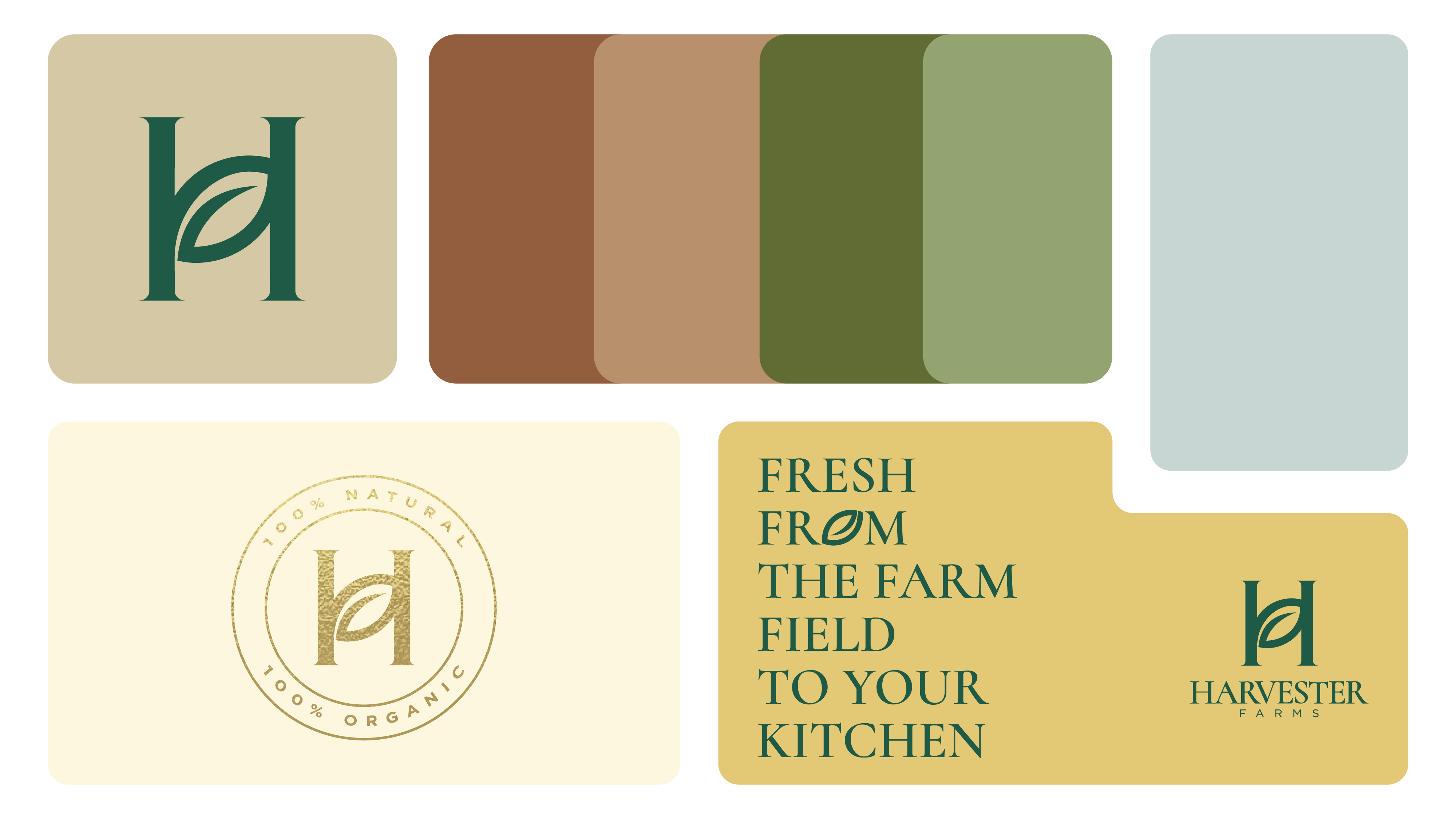
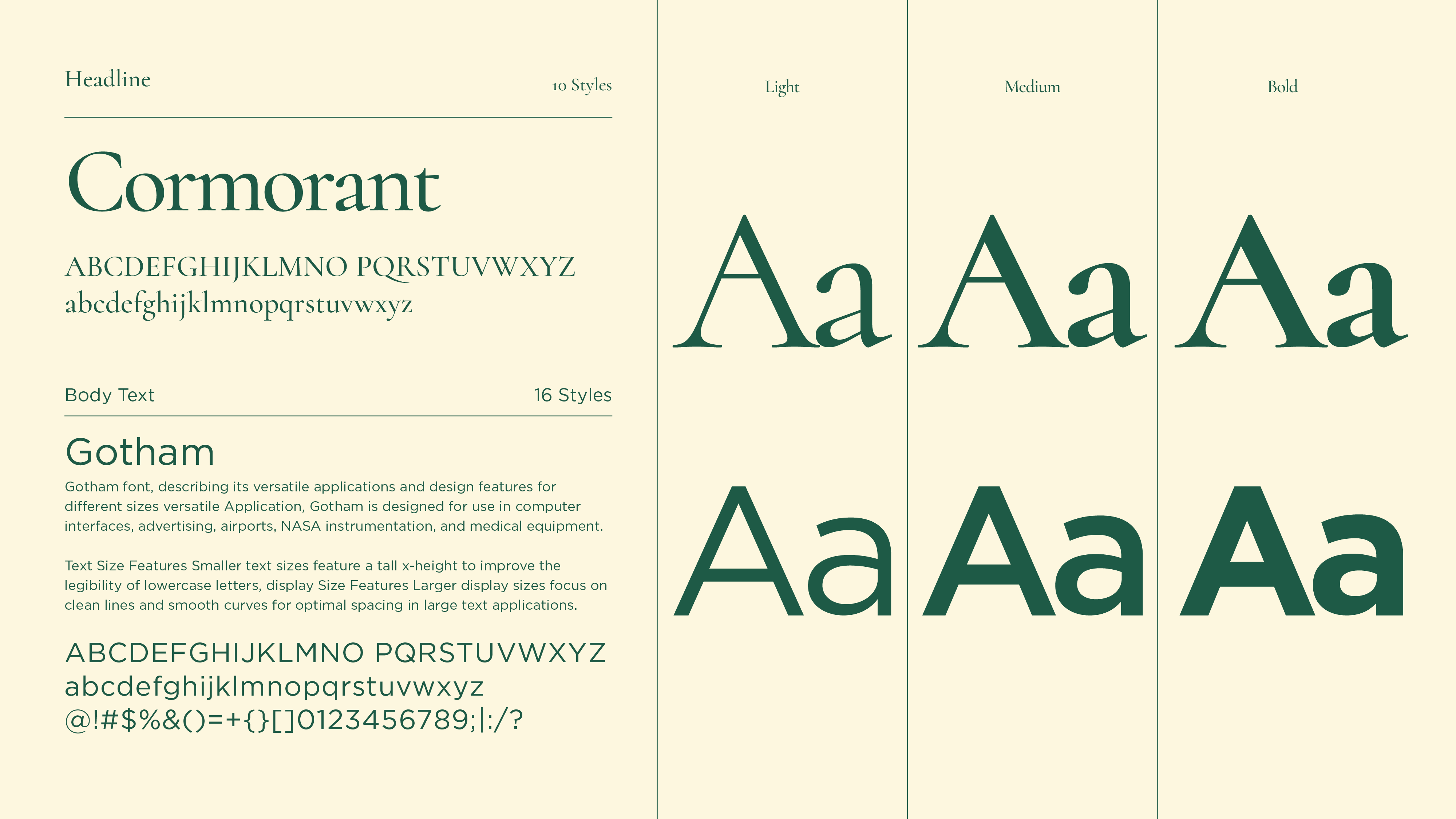
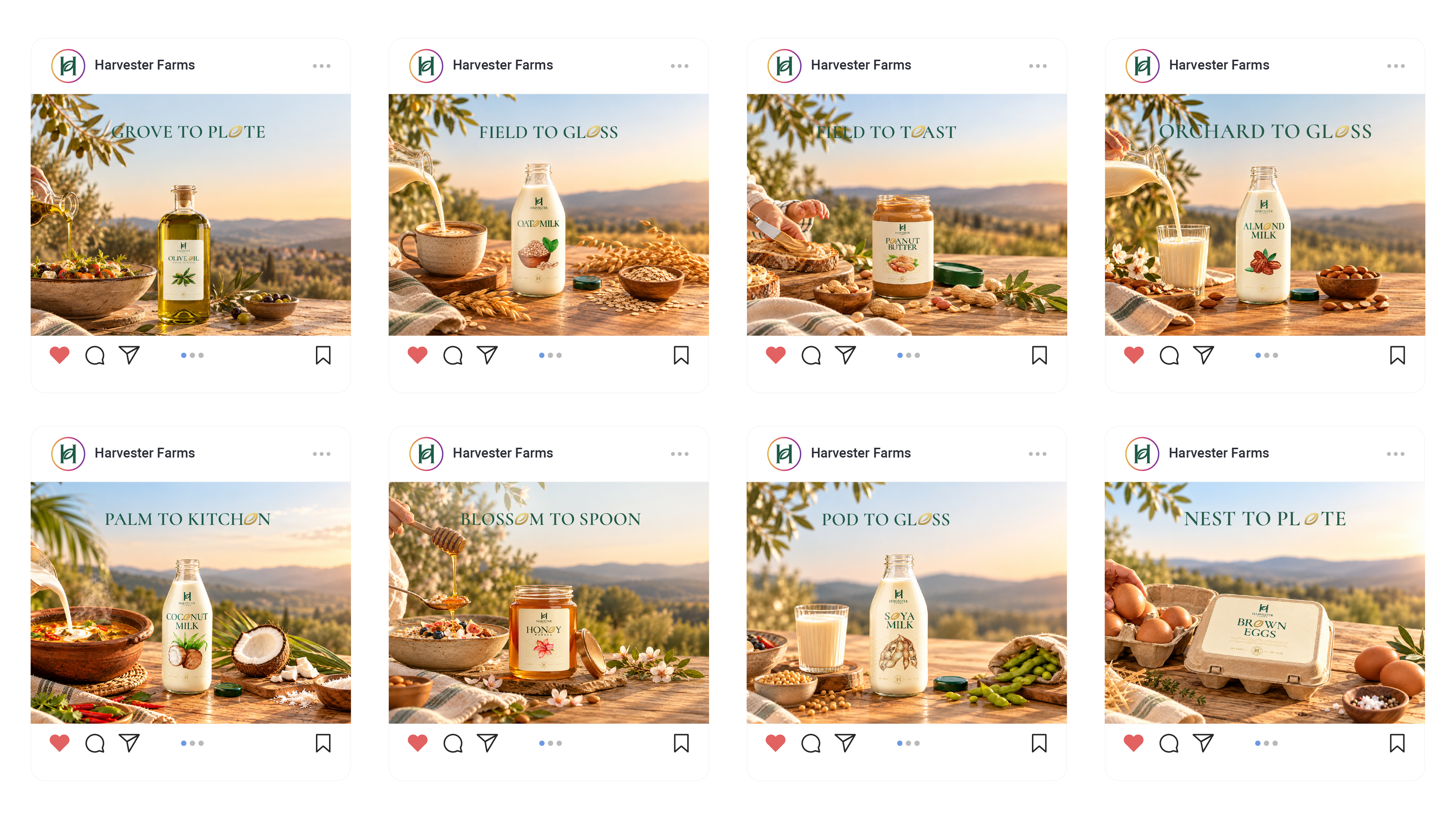
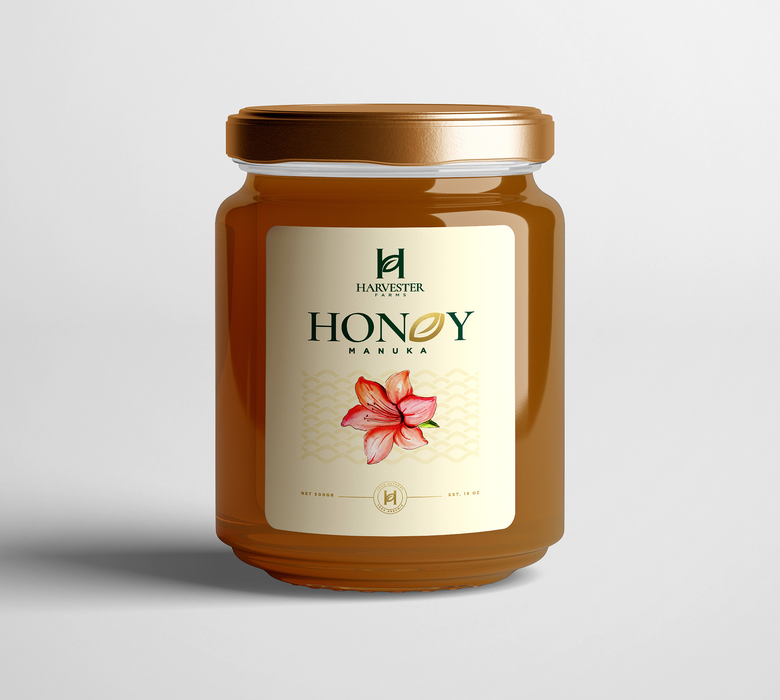
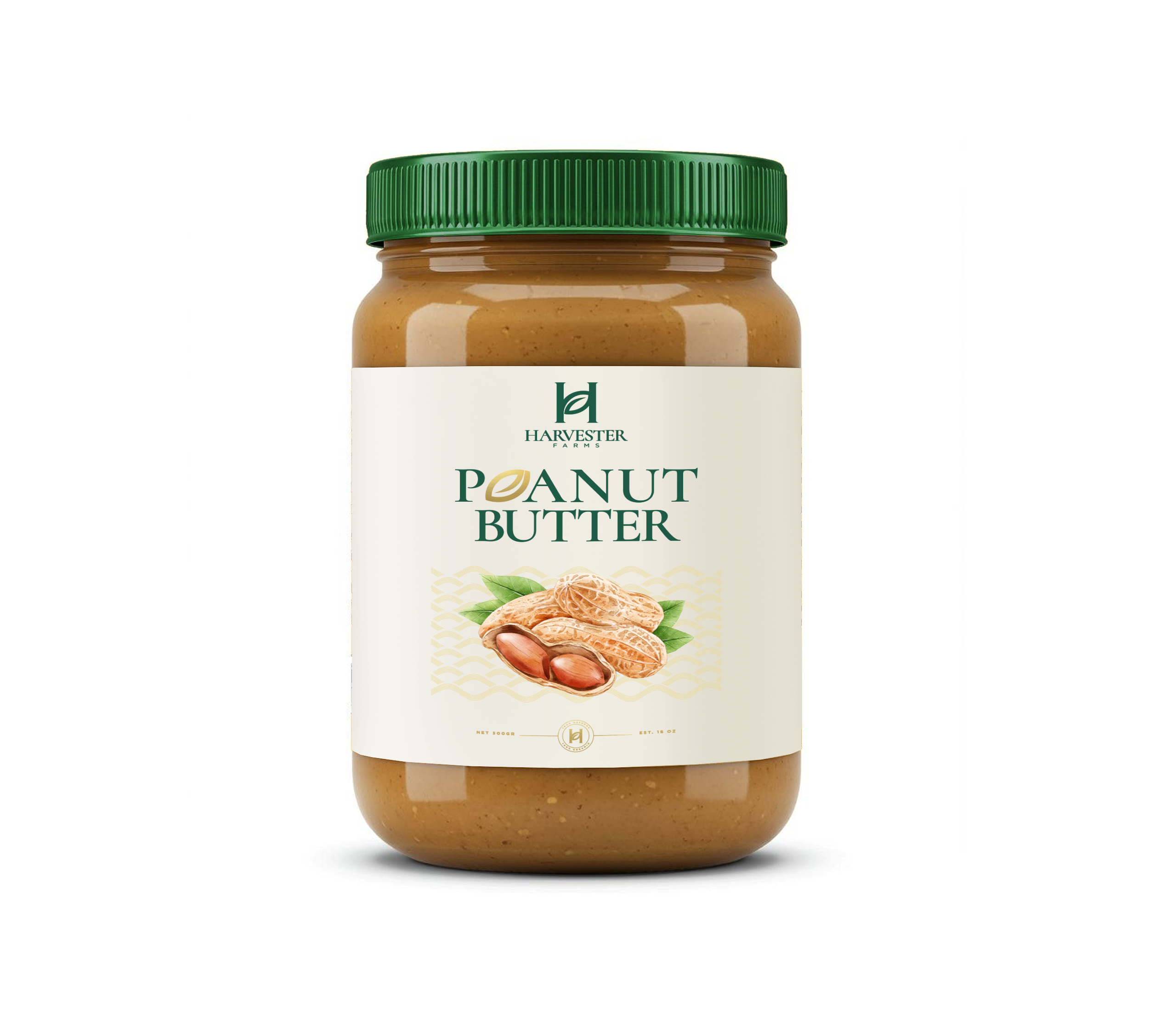
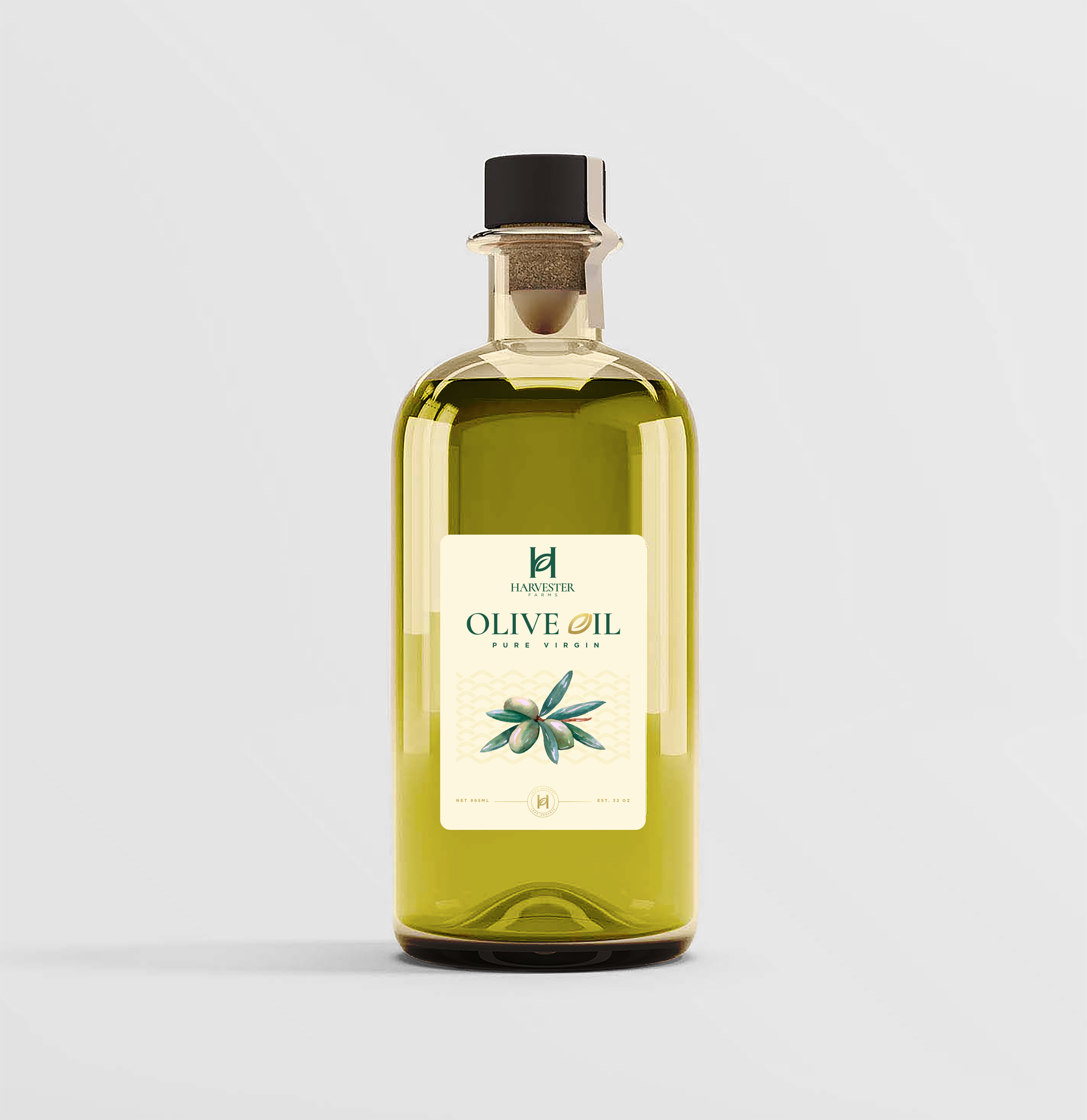
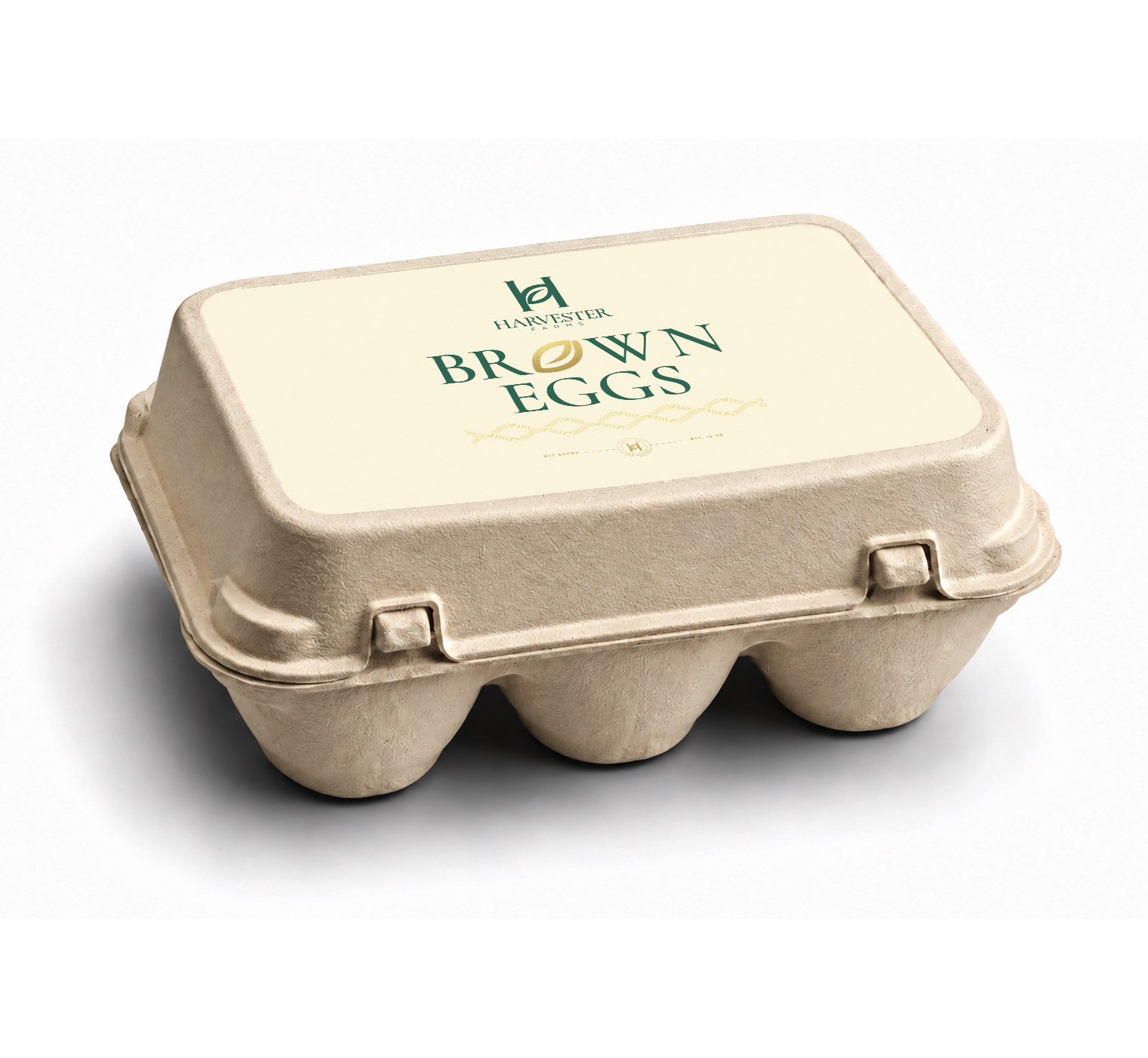
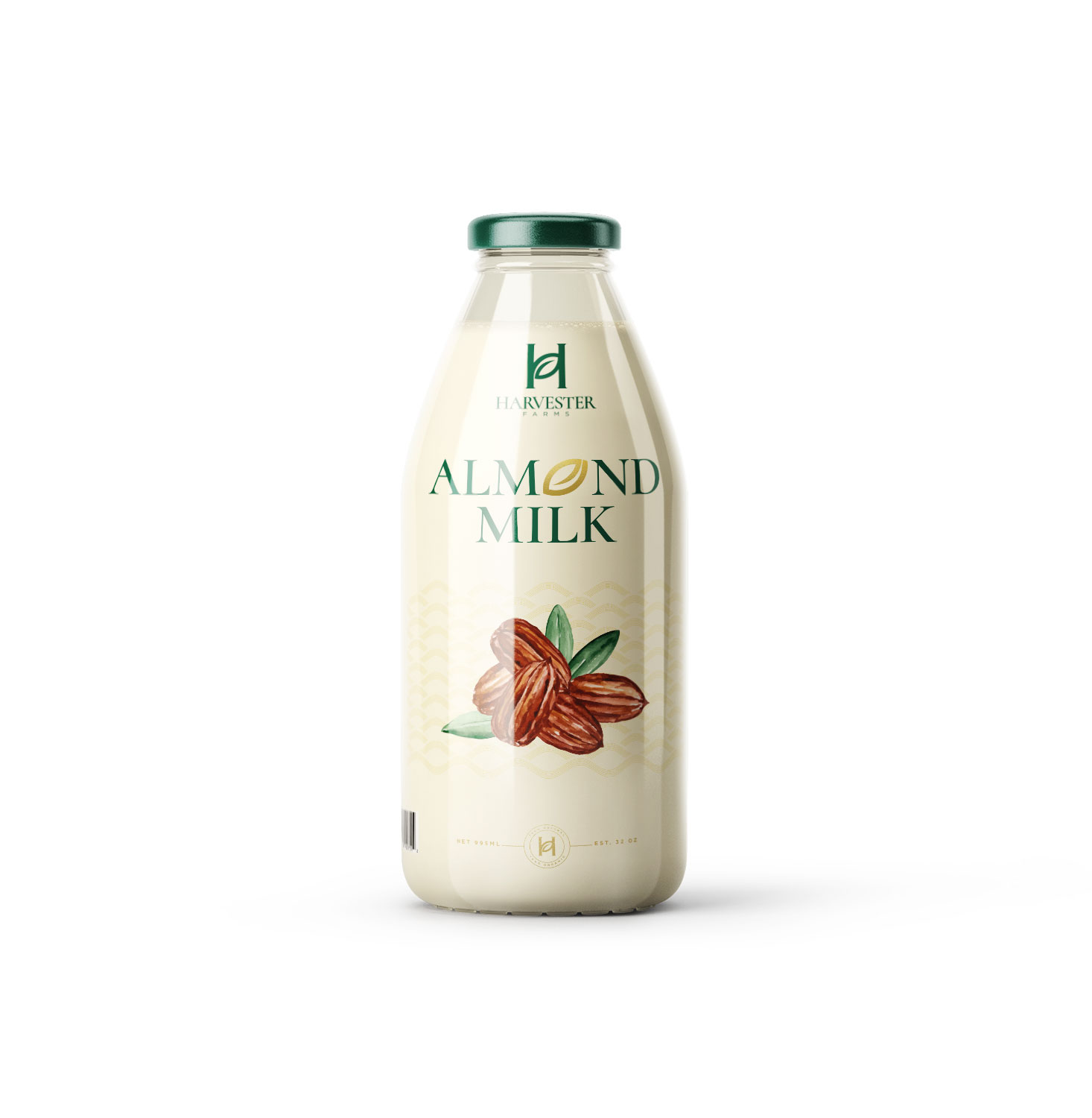
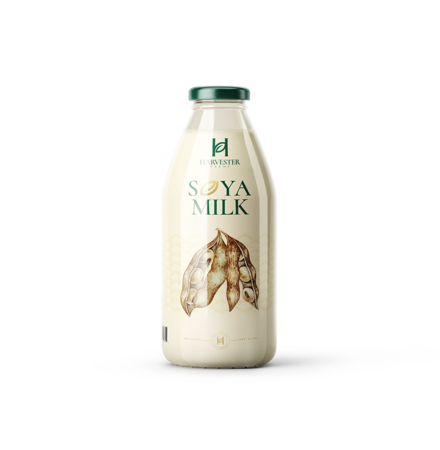
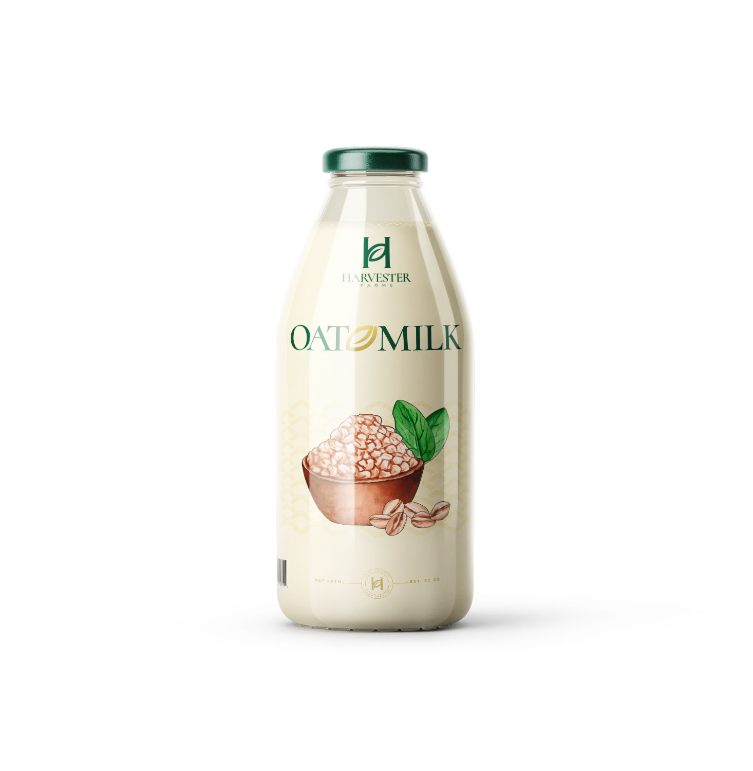
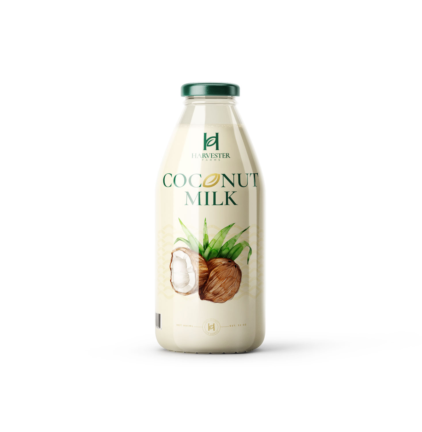
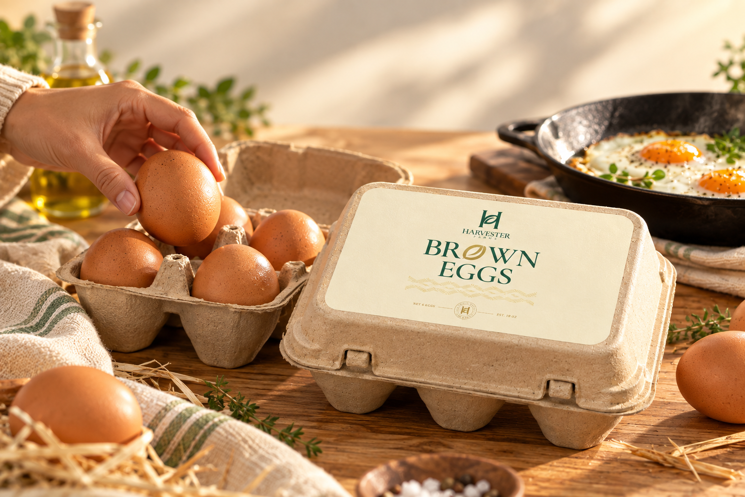
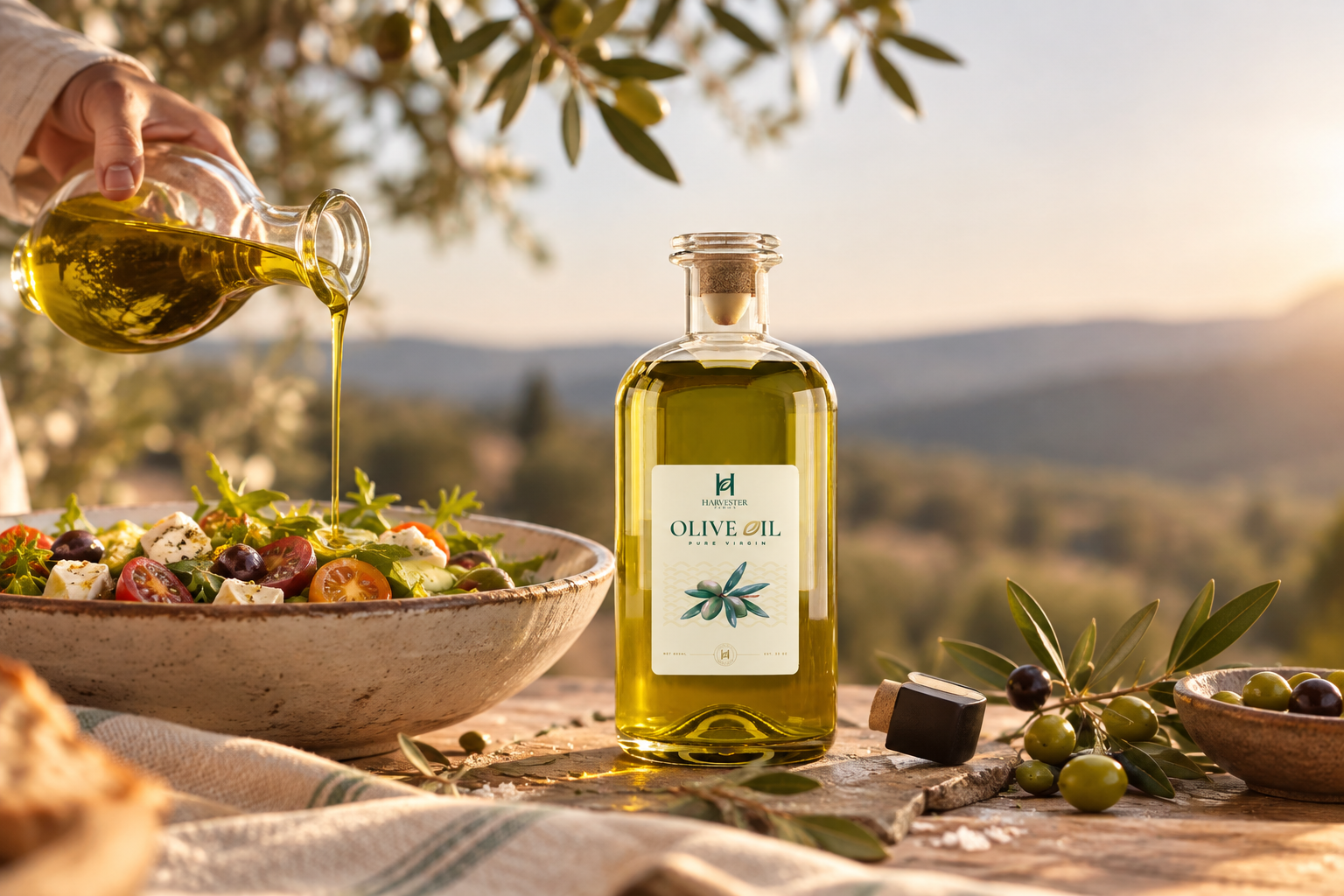
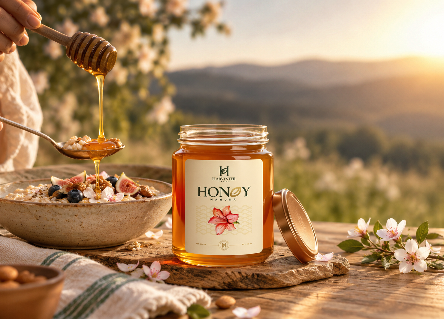
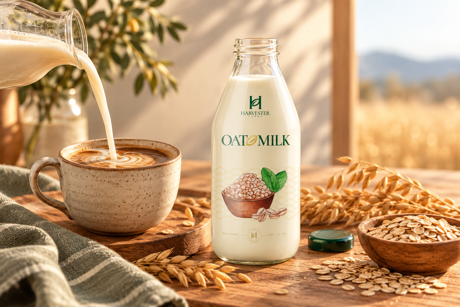
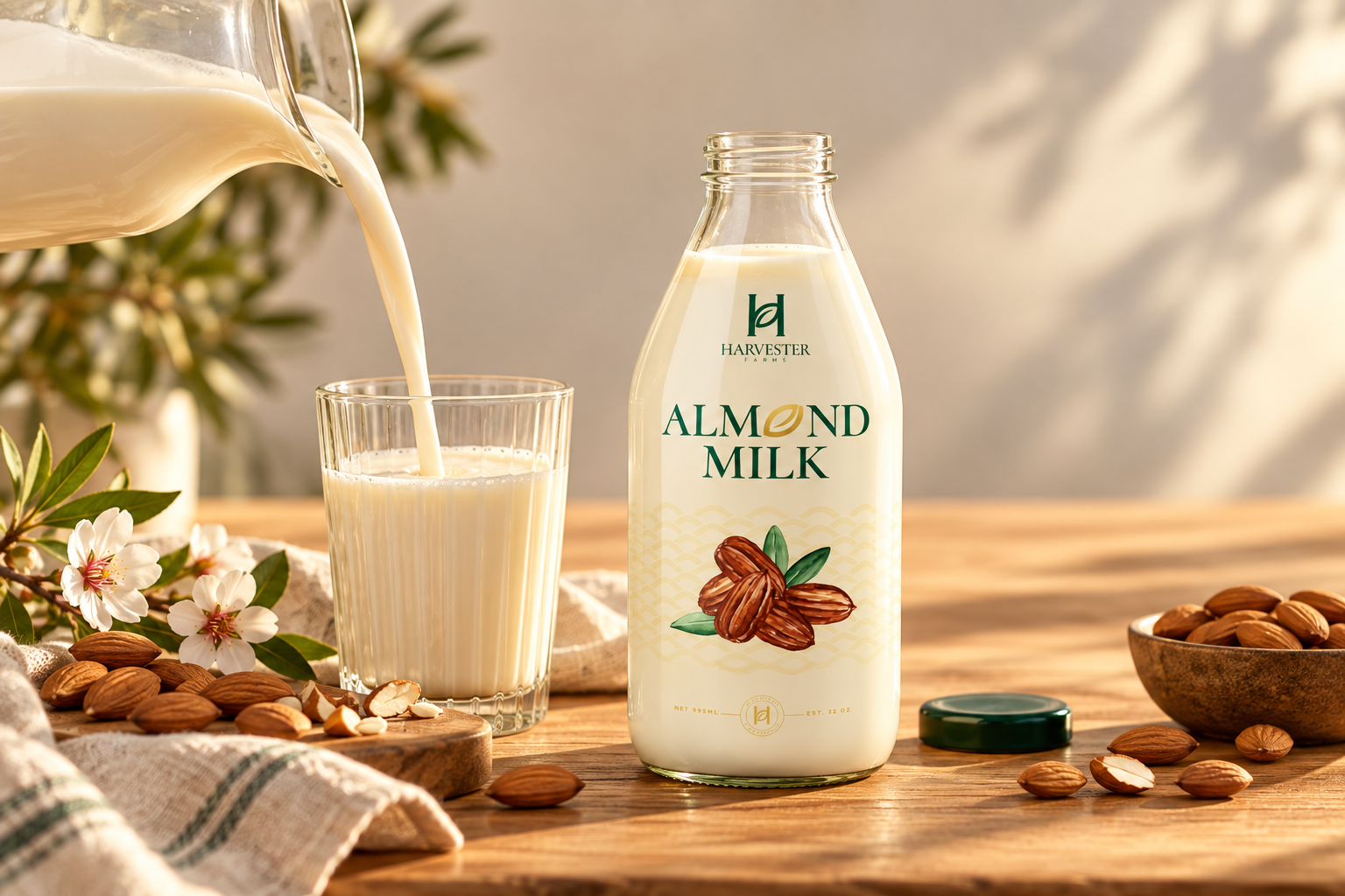
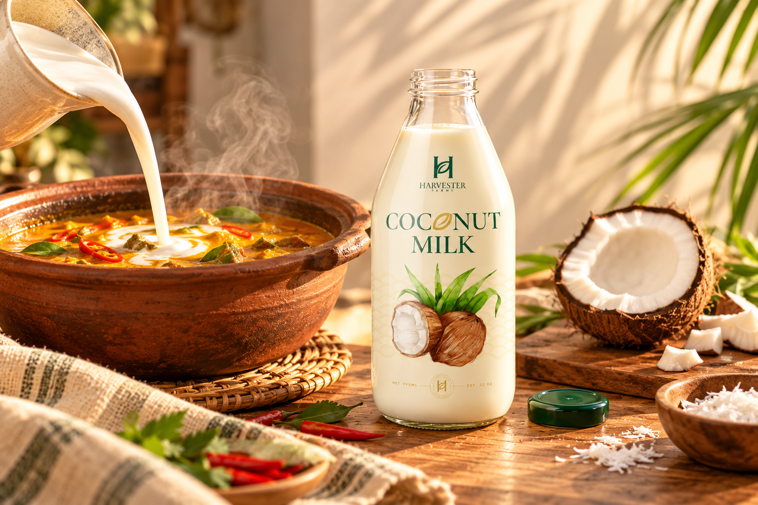
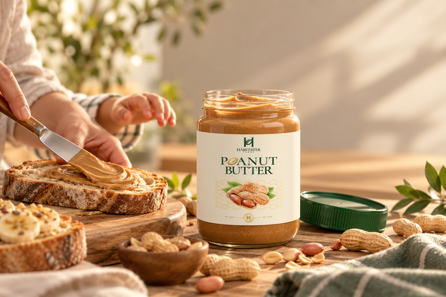
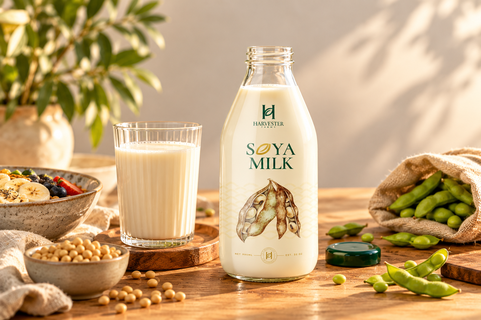
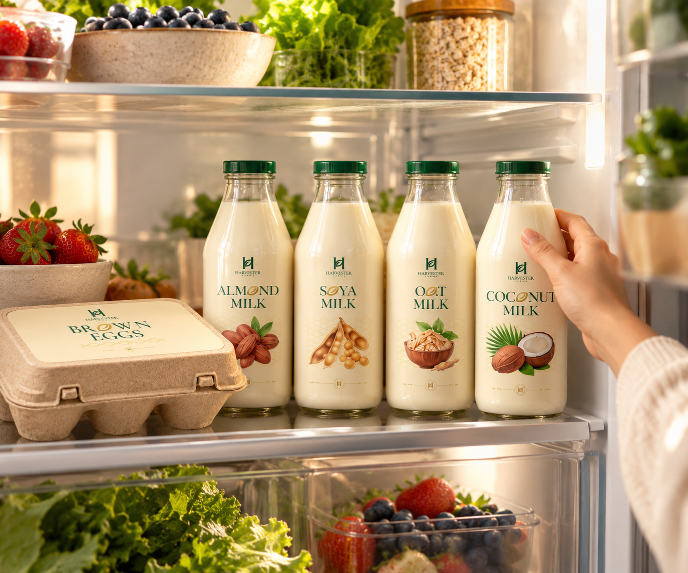
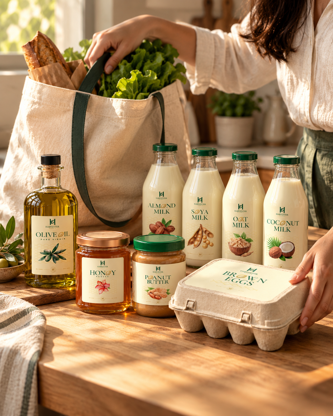
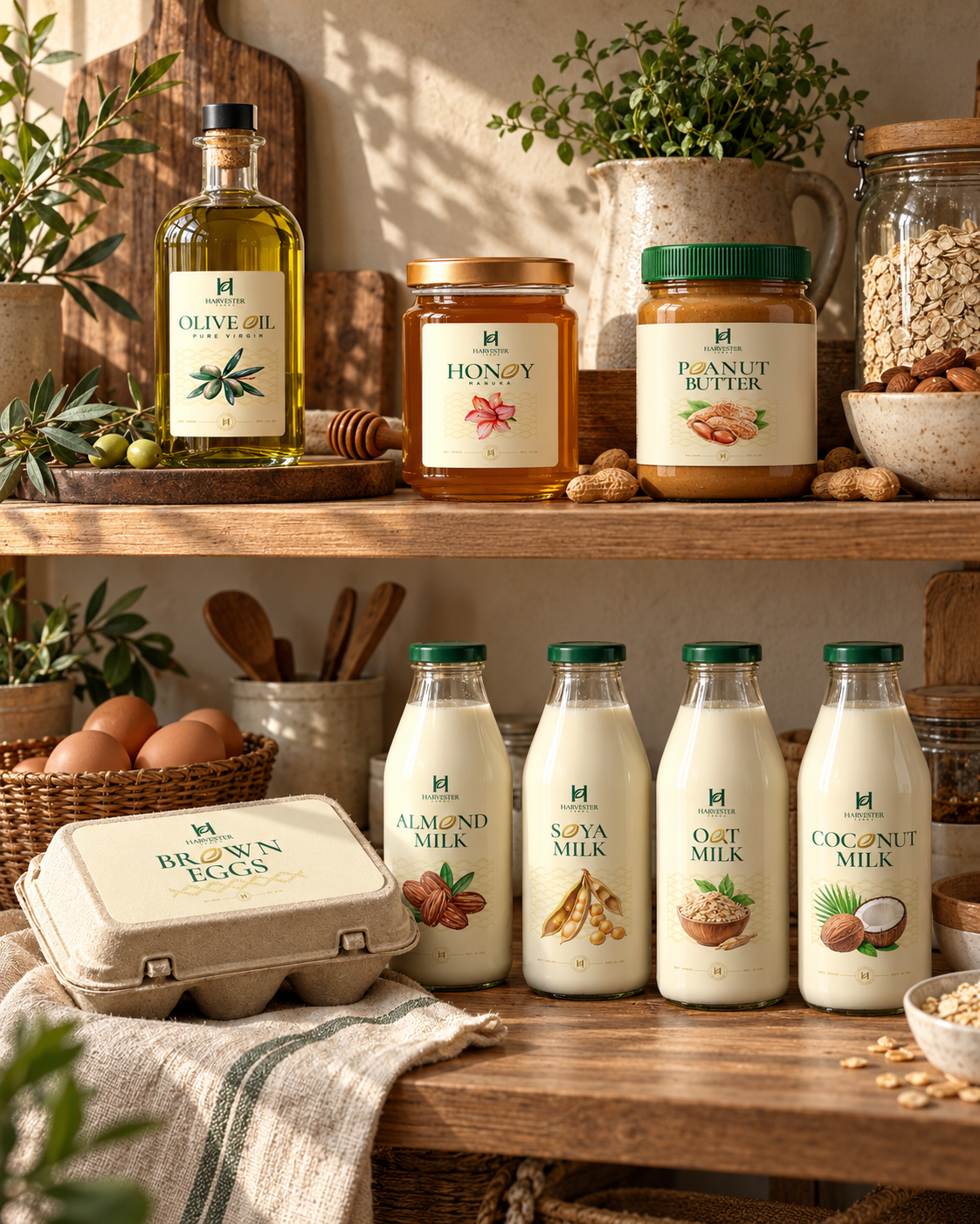
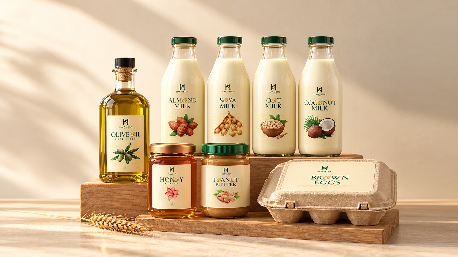
Harvester Farms based from Austrailia is being repositioned from a dependable organic supplier into a premium, story-led pantry brand built on one simple promise: honest food, harvested with care. The refreshed strategy brings honey, olive oil, peanut butter, brown eggs, almonds, oats, soya, and coconut milk under a single, cohesive voice that feels warm, transparent, and quietly confident. The identity evolves with a cleaner Brandmark & emblem, an earthy palette drawn from soil, grain, and golden harvest tones, and a modular packaging system where each product carries its own accent colour and natural illustration while sharing a consistent grid, typography, and origin story. The result is a shelf presence that feels crafted rather than commercial, instantly recognisable across categories and designed to scale as the range grows.
Strategy
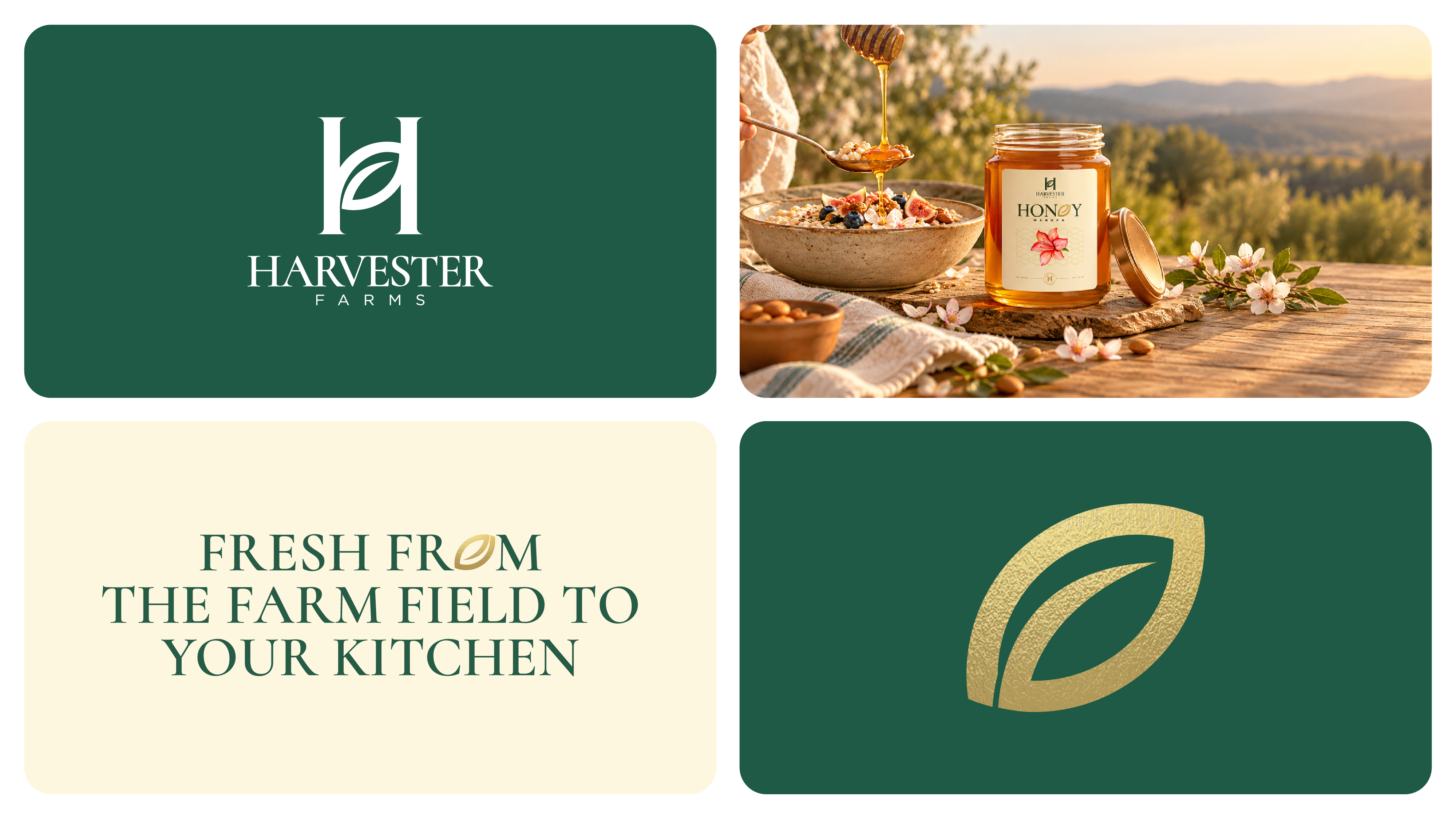
Fresh from the farm field to your table.
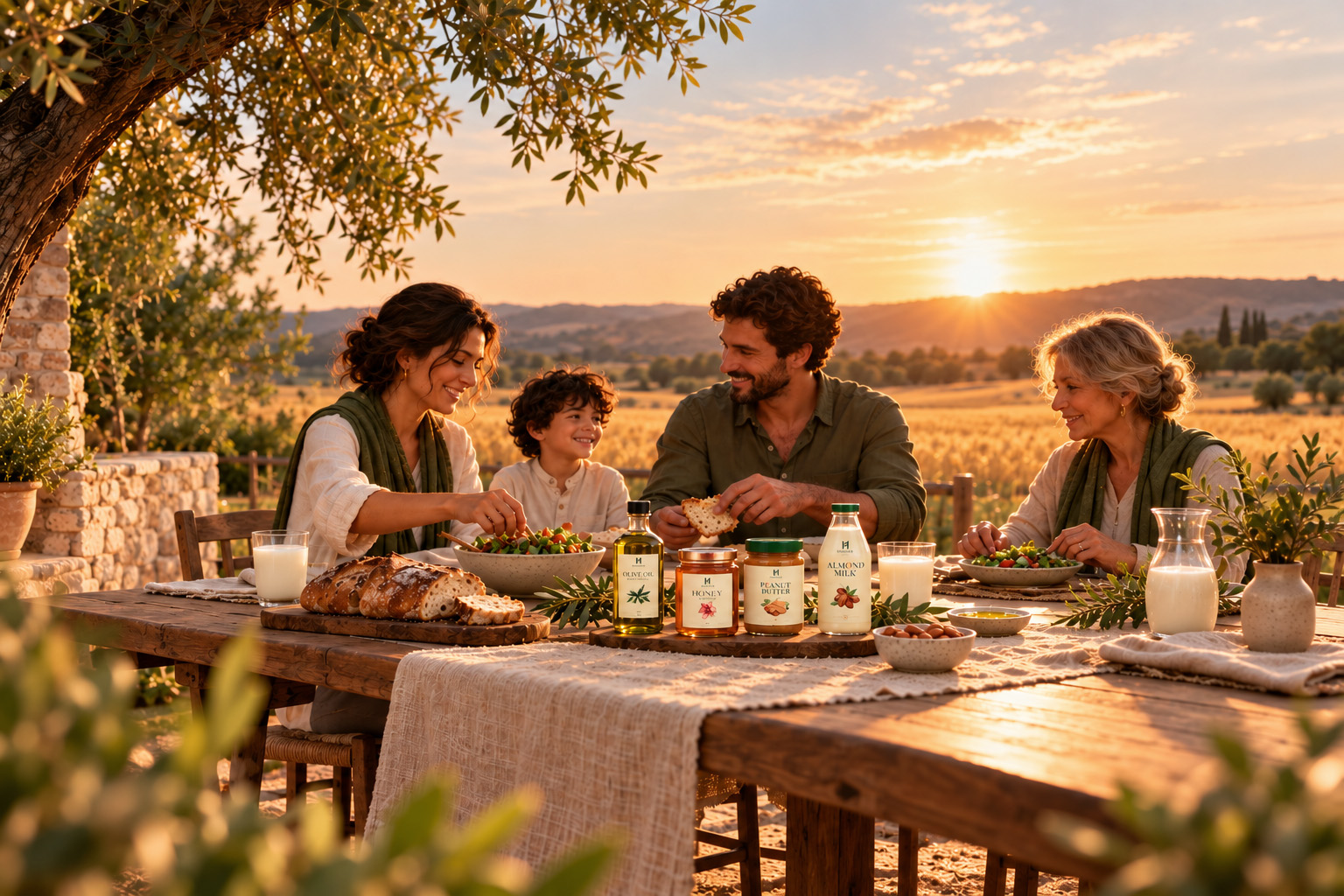
Harvester Farms brings the honesty of the farm straight to the modern kitchen. Built around the idea "Fresh from the field to your table," the brand celebrates real ingredients in their purest form, from golden honey and rich olive oil to wholesome oats, almonds, and farm-fresh eggs. The positioning sits at the sweet spot between artisanal and accessible: premium enough to feel special, simple enough to become a daily ritual. By leading with origin, purity, and care, Harvester Farms becomes more than a pantry brand; it becomes a trusted partner in how families choose to eat well.
Brand
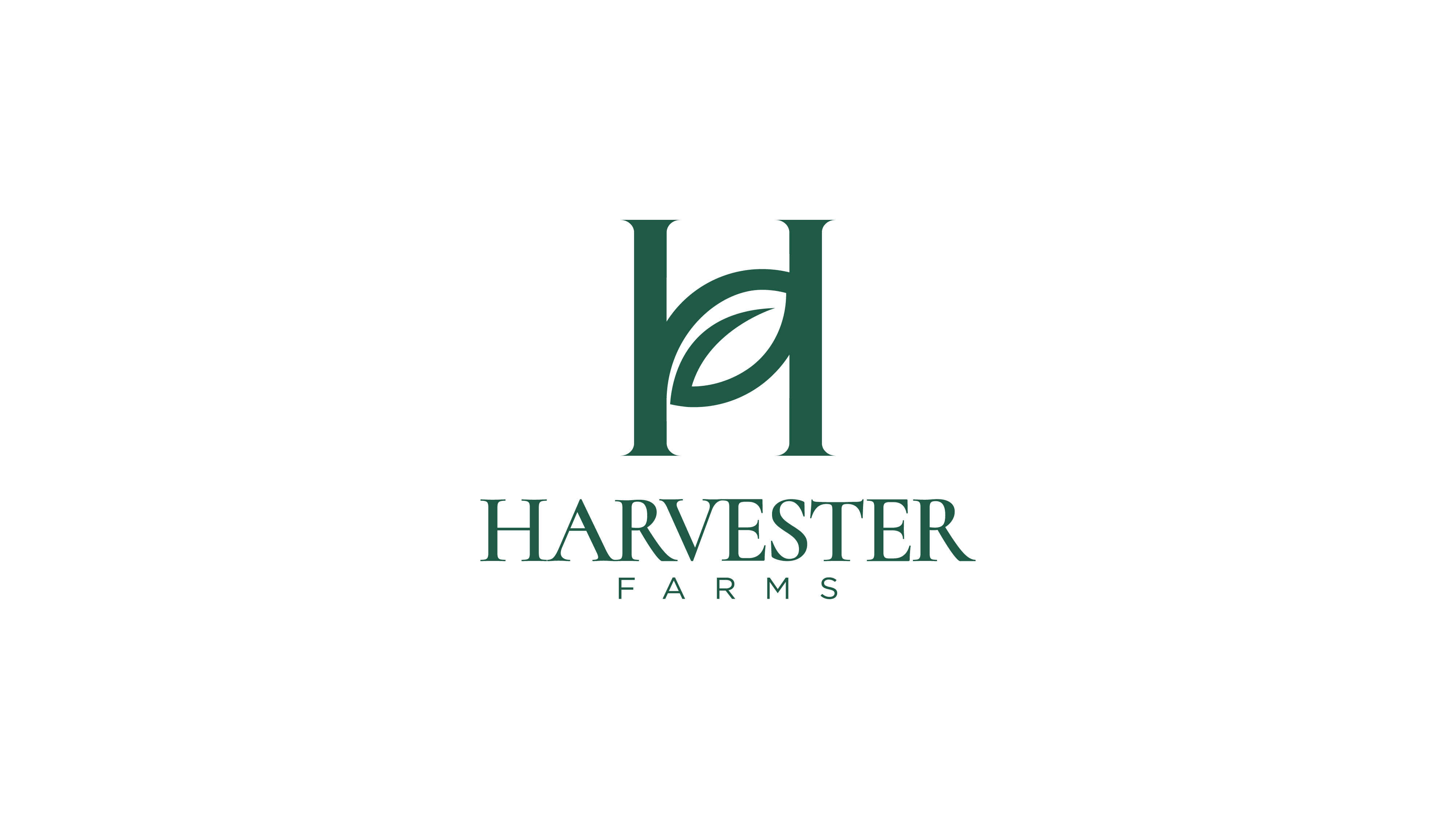
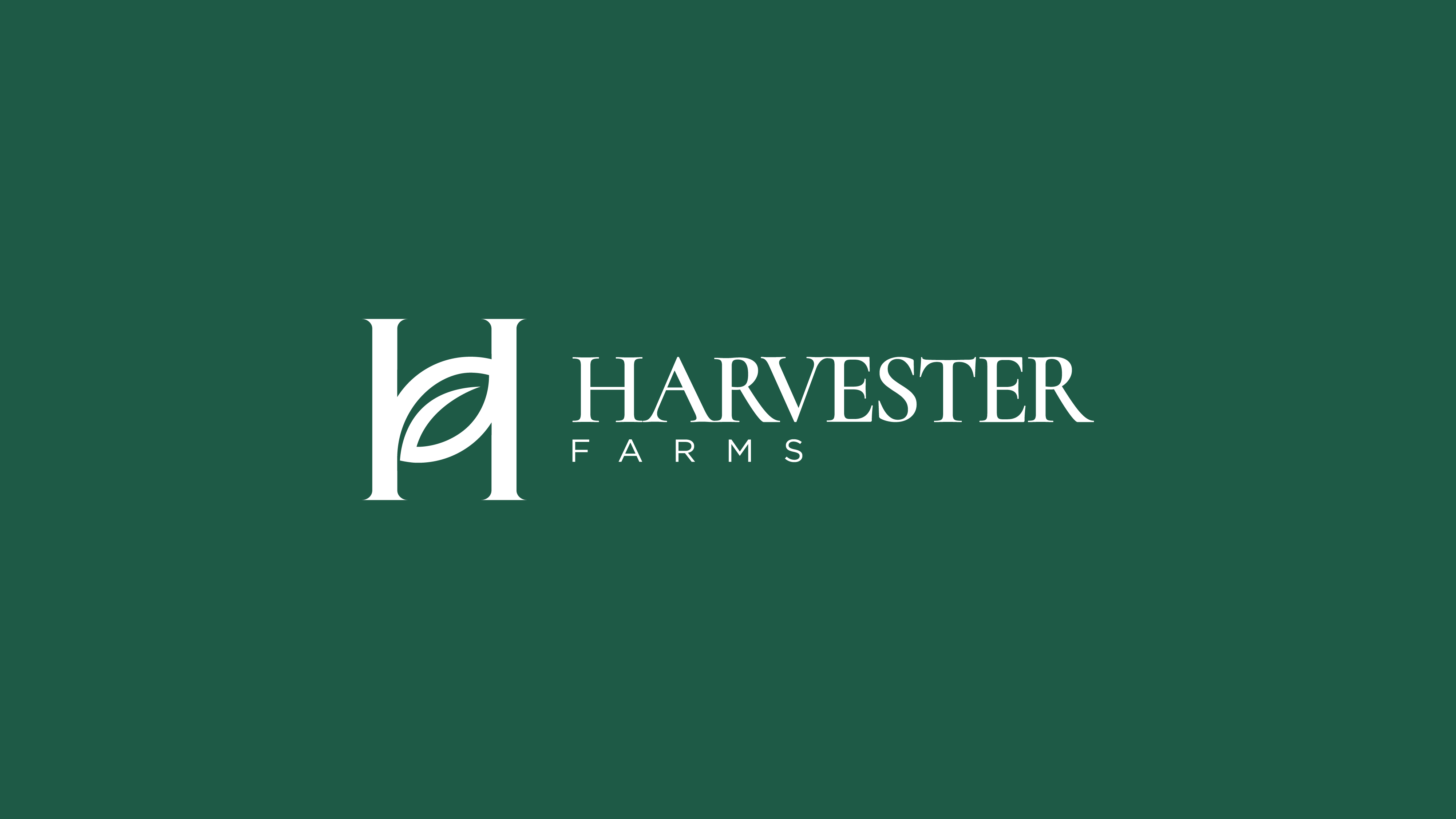
The mark is built from two simple ideas. The serif H stands for Harvester and takes the shape of a house, a symbol of home, family, and the daily rituals that happen around the table. A leaf replaces the crossbar, so growth becomes the very thing that holds the home together. Together, they tell the brand's story in one shape: fresh from the field, straight to your table.
Outcome
- One brand, one story: A diverse product range connected through a single, memorable farm-to-table narrative.
- Elevated packaging: A refined, nature-inspired design system that stands out on shelf and signals quality at a glance.
- Ownable positioning: A clear space between mass organic and niche artisanal brands.
- Built for growth: Flexible design guidelines that make future product extensions fast and consistent.
- Deeper customer connection: Origin-led storytelling that turns everyday purchases into brand loyalty.
- Seamless brand experience: Consistent identity across retail, e-commerce, and social channels.