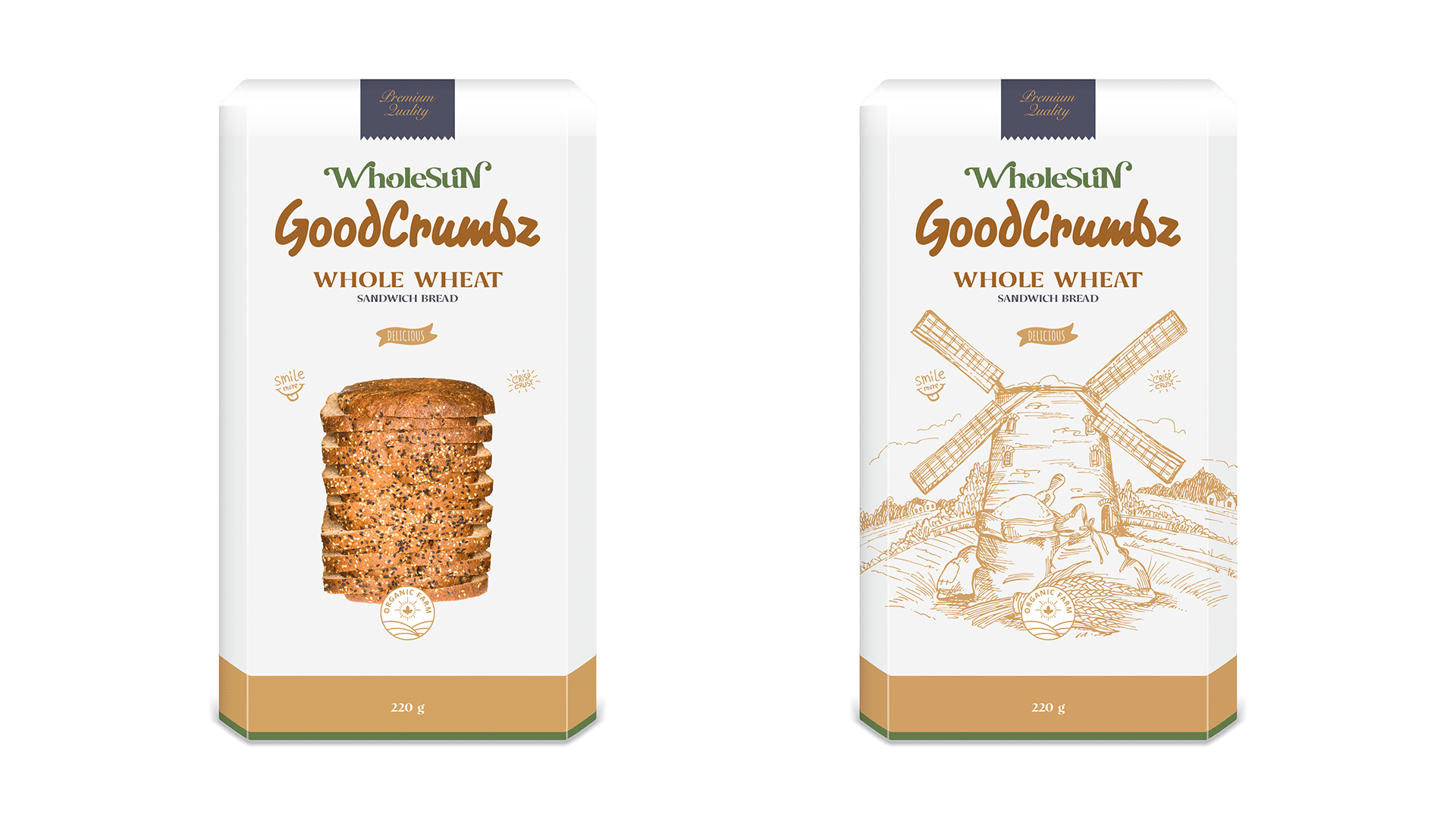
WHOLESUN FOOD - CCL
OBJECTIVE: Along with being a global healthcare multinational right now, the CCL conglomerate plans to expand towards Life Sciences, Beauty & personal care & Food business to grow and diversify as a powerful conglomerate. The CCL group has decided to set up a food company to cater to the nutrition aspect. We need to build a brand identity for the food business based on two houses of brands architecture choices, evaluating the merits and pitfalls of both.
VISUAL DESIGN DIRECTION: A purposeful typography logo transcends letters, encapsulating a brand's narrative and character. In this intricate dance of design, it forges a powerful symbol, establishing an immediate and lasting connection with the audience. Injecting a combination of playful doodle vibe and flat symbols into WholeSun packaging design doesn't just soften the box's edges; it unveils a whole new level of fun and exclusivity. It's like our brand's way of sharing a joyful secret handshake with customers in touch with their inner child.
WHOLESUN | CCL | OGILVY


