

BLISS HOTELS & RESORTS
OVERVIEW: Nestled amidst the rugged beauty of the mountains, served as the final sanctuary for travelers in the early 1900s, bridging the gap between arduous journeys by horse-drawn carts and the comfort of train travel. Its role as the last stop before the Rocky Mountain Region instilled a profound sense of belonging and camaraderie among visitors, offering respite and the opportunity for organic connections. With dedicated station personnel going beyond the call of duty, Bliss became synonymous with care and hospitality. Its quaint eateries and bars provided a haven for weary travelers, fostering a culture of holistic well-being and natural camaraderie. Each arrival at Bliss was not just a destination but an experience, characterized by genuine interactions and a shared sense of adventure, making it the embodiment of wholesome care and a true haven for like-minded souls on their journey.
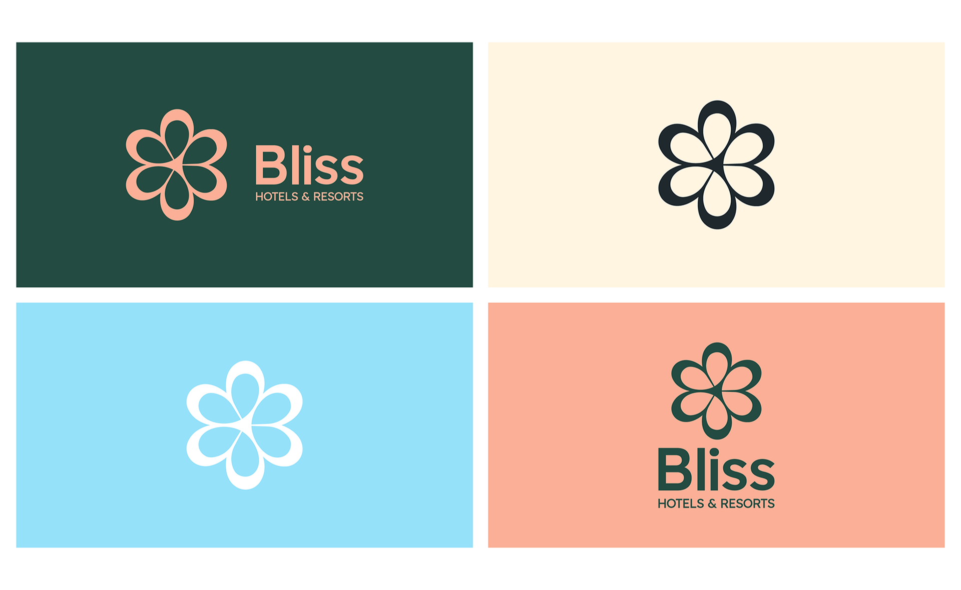
VISUAL DESIGN DIRECTION: I visually capture the brand's tonality, ensuring it stands out in the cluttered hospitality industry. "Bliss"meaning flower happiness, pleasure & satisfaction, serves as our guiding principle. I've incorporated the heart symbol into the first letter of the brand name, "B" to make it more relevant and simplified, resonating with our primary objective of providing premium hospitality. This addition also adds depth and engagement to our visual design language.
BLISS HOTELS & RESORTS CANADA | OGILVY


